My one time colleague (Evan Lawrence-Hurt) posted the following:
In Colombia I was able to purchase an iPhone SIM card for 7 pesos (~$5), got great reception and data that lasted a week with no contract and I could refill it whenever and wherever I wanted. Here in the U.S. I pay Verizon >$100 per month for the same service on a 2 year contract. Discuss.
Since I’m not teaching this semester, I’ve really missed the fun, illustrative graphs that can get at the heart of a question. First, the set of disclaimers. I have no special expertise in the complicated field of cell phones. This is a gross simplification, and probably wrong in a bunch of ways. I did not spend the time to actually look at data points such as regulations, market concentration, comparative consumer buying power, etc.
In the cell phone market, the biggest cost are no doubt fixed. The fixed cost of laying down physical communication lines, building towers, buying/leasing wireless spectrum cost a lot more than the marginal, per-user/megabyte cost, which in small quantities is near zero. Also, irrespective of the regulation regime, it is very difficult to have a very competitive market. Cellular providers are close to what is called a natural monopoly. This means that once fixed cost are covered, the price that is charged is determined mainly by two things: the composition of the demand curve and the ability of the telecom companies to price discriminate.
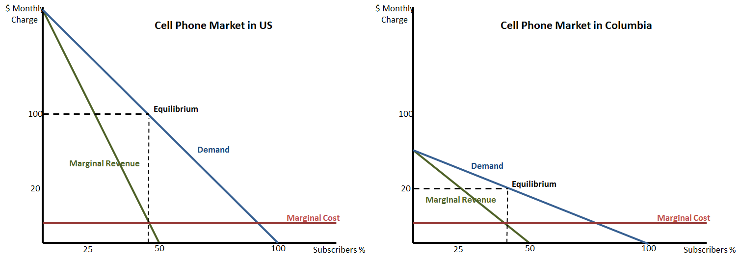
So, if we 1) assume that the market is similar to a simple monopoly (and ignore price discrimination), 2) realize that because American’s have more disposable income they have a higher willingness to pay, we can draw the simple monopoly set up for each country:
I apologize for the crudeness of these charts and this analysis, but I think it actually gets pretty far. We start with the two demand curves. The higher disposable income in the US is reflected by the higher demand curve (willing to pay more at any quantity). We then put in the marginal cost curves, which for simplicity I’ve kept low, constant and the same across the two countries. The marginal revenue curve is the extra revenue the monopolist sees by lowering the price and selling another plan. Because the monopolists are not price discriminating in this example, it is a simple downward sloping curve.
A profit maximizing monopolist will sell at the point where MR=MC. While the quantity that this happens at is not very different across the countries (looks to be near 40% in this totally made up example), due to the different in the demand curves the price that reaches the profit maximizing quantity is actually very different.
So what this very simple analysis tells us, is ignoring any differences in regulations, market structure, population density, etc, a lot of the variation in prices could potentially be explained simply by the differences in consumer disposable income across countries.
